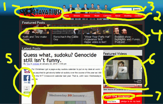
If you’re reading this post, I assume you’ve already noticed that something is amiss in the web world of Octavarius. It was probably the very first thing you noticed on arriving at the site today if you are a returning visitor. Well your eyes do not deceive you. We’ve redesigned the website.
We’ve had the old website in basically the same format since we started chronicling our improvised journey through adulthood back in late March of 2009. And we loved the old site. But we’ve grown a lot and the site needed to catch up.
Since we started we’ve done nearly a show a week, written 510 posts, and filmed a slew of short films. We wanted a website that would emphasize the stuff you’ll like the most. And now we’ve got it, and more.
What follows is a brief tour of the new features of the website that will hopefully make your time here even more fun than before.

Feature 1 – New Logo
It’s not a major change, but I did want to point out a couple of things we laughed about in the design process. First, the octopus that Tinz used as the silouette for our original logo (plus one wicked arm) is now the “O” in our name. And he’s about the eat the other letters. Dumb, I know. No apologies.
Feature 2 – Better Navigation
As I said above, we’ve done a butt load of new stuff, and it’s easier to find now with the nav bar. We’ll be adding categories as we think of even more dumb things to do too.
Feature 3 – Search Bar
It’s a bit easier to find now. Give it a try. Look up “8:45” and watch, perhaps, the single dumbest thing on this website.
Feature 4 – Features
Sometimes we share funny videos and links that are good for a quick laugh. The rest of the time we’re focused on making original, belly busting, dumb stuff that you don’t want to miss. Now you never have to. Check the Featured Posts bar on the homepage whenever you visit to make sure you’re up to date with the latest, greatest things going on here.
Feature 5 – Sharing
A lot of people were asking for easier ways to discuss and share the stuff on the website. We think we’re pretty hilarious, but most of the time, you’re even funnier. With these sharing links you can send posts by email, Facebook or Twitter, and add your own fun discussion, mockery, or comment to make them your own. Give it a try on this post. It gives you a nice tingly feeling.
Plus, we still offer Facebook Connect for all your on post comments. But if you’re not into Facebook Connect, you can now comment without an Octavarius account.
Feature 6 – Featured Videos
This is a YouTube Playlist of our favorite video content. Click play and sit back, because that’s all you’ve got to do.
Feature 7 – Join the Invasion with the Octavarius Pledge
A lot of websites feature boring email list signups. We hate those. The last thing we want is a boring email list. So in place of a one way newsletter, we’ve started the Octavarius Pledge. Take the pledge, and let us know what sort of fun you’re making in your area. We’d love to share it with everyone we know. And if you’re in Chicago, maybe we can find fun together.
Feature 8 – You
That’s the most important part of this website to me. We want to know what you like, what you think is funny, and how we can make more of that with you. Every aspect of the new website was made with you in mind, so if you have any questions or comments on the changes, please comment on this post, or send us anonymous feedback.
If you like this web design and are looking for a website for your company or group, please contact us. The price is low, and half of the proceeds go to support Octavarius and the Fun Invasion.